
Plaid has a bit of a reputation. It can feel traditional, a little preppy, maybe even a little predictable. But you can’t walk into an interiors showroom or fashion boutique without encountering it right now, and I personally think it deserves a bigger place at the pattern mixing table.
With its intersecting lines and layered colors, a traditional plaid already shows up with a LOT of pattern going on. But plaids come in all sorts of personalities, from bold and graphic to soft and understated, and everywhere in between. A tartan plaid, in particular, often contains several colors, giving you plenty of options when choosing patterns to pair with it.
So, how do you mix plaid with other prints without making everything compete for attention? The same principles apply to mixing any patterns: look for common ground in color, consider scale, and think about how different types of prints work together. And don’t forget to squint your eyes and do the very important vibe check!
I've put together four combinations to show just how many directions you can take a simple plaid.

Geometry in Motion
Let's start with a combination that has a bit of graphic punch. This dark plaid has plenty going on already, with intersecting lines in navy, black, rust, and cream. Rather than adding another linear pattern, I paired it with a geometric print made up of hand printed circular forms.
What makes this combination work is the contrast between the two patterns. The plaid is all straight lines and defined blocks of color, while the geometric print introduces a round repeating shape. The dark charcoal and cream palette gives them common ground, and the contrast brings the pop.
The takeaway? When your first pattern is made up of straight lines, try introducing something with curves. You don't need to find another pattern that looks like it belongs to the same family.

Straight Lines Meet Squiggly Lines
This pairing takes a slightly different approach. Here, the plaid is warm and saturated, with rusty orange, deep red, and blue. I've paired it with a looser, meander pattern in similar shades of blue.
The colors do a lot of the work here. Blue and orange are complementary colors, sitting opposite one another on the color wheel. It's a classic combination, but the different shades keep it from feeling too predictable. The blue in the accompanying print picks up the blue threads in the plaid, while the warmer background adds another layer of contrast.
I also like the difference in character between these two prints. The plaid is structured and orderly, while the winding lines of the coordinate are much more freeform. Neither one is trying to do the same job.
If you're working with a structured pattern, look for something a little less predictable to balance it out. A loose, abstract print can be a welcome change from all those straight lines.
 A Softer Take on Plaid
Not every pattern combination needs to make a big statement. This pairing is a good example of how to mix prints while keeping the overall look a little more relaxed.
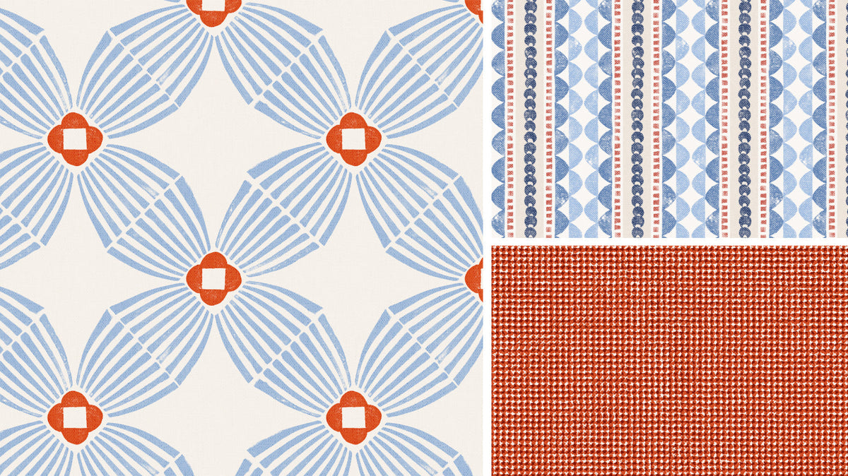
The plaid in this case is still traditional, but combines a much lighter color palette to soften it up. For its partner, I've chosen a scalloped, decorative floral in a similar dusty blue and cream. The colors connect the two patterns, but it's the difference in their character that makes the pairing interesting.
This is also a good example of playing with density. The plaid's fine intersecting lines create plenty of detail, while the larger floral shapes offer a little visual breathing room. Neither pattern has to compete for attention.
If you're pairing a traditional pattern with something more decorative, look for a shared color and let the difference in style do the rest.
 Leopard for the Win
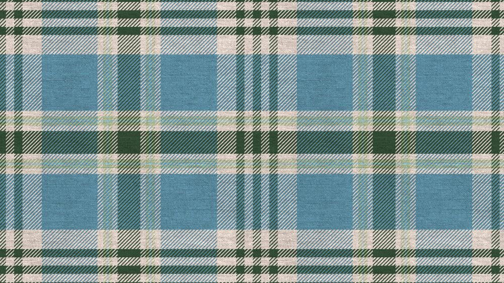
For the final pairing, I've gone with a blue and green plaid alongside an abstract animal print.
The blue is the obvious connection here, appearing in both patterns and giving the combination an easy sense of cohesion. But I think it's the contrast in pattern style that makes this one interesting.
The leopard print feels completely unexpected in combination with a plaid, yet some of my favorite combinations happen when you take two patterns that seem like unlikely partners and find the little details that connect them.
So, What's the Secret to Mixing Plaid?
If there's one thing I'd like you to take away from these combinations, it's that there isn't one formula for mixing patterns. You don't need to match everything, and you certainly don't need to stick to patterns that share the same style. Instead, start with a few simple considerations:
- Find a common color. Look for a shade that appears in both patterns. It doesn't need to be the dominant color in either one.
- Pay attention to scale. Try combining a smaller, more detailed print with something larger and more open.
- Mix different pattern types. Pair the straight lines of a plaid with a floral, geometric, or more organic design.
- Think about the overall feel. Squint your eyes and consider the bigger picture. Do the patterns feel like they belong together, even if they don't look alike?
And perhaps most importantly, don't be afraid to experiment. Sometimes the combinations you least expect to work are the ones that make a room feel truly individual.
Plaid is a wonderful place to start, but make sure to keep going!
Any of the designs you see here can be customized for wallpaper and/or textiles, so feel free to get in touch!