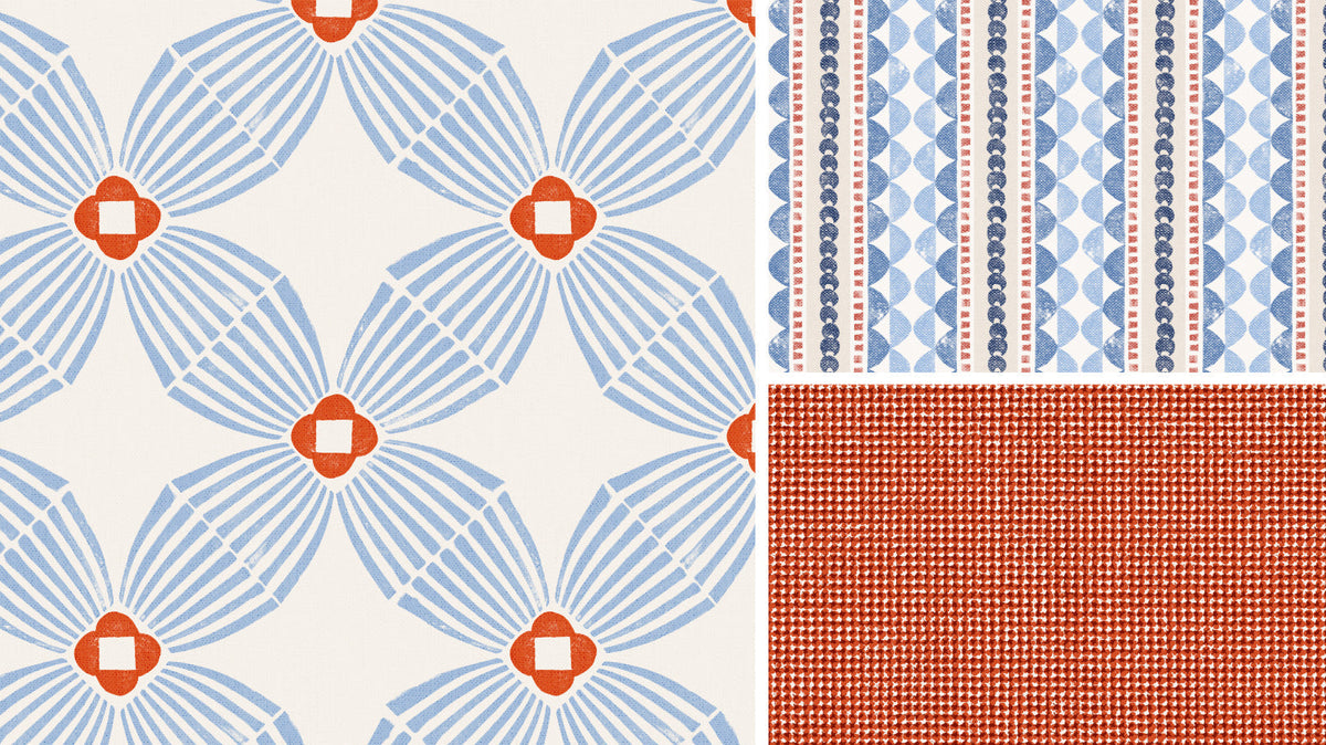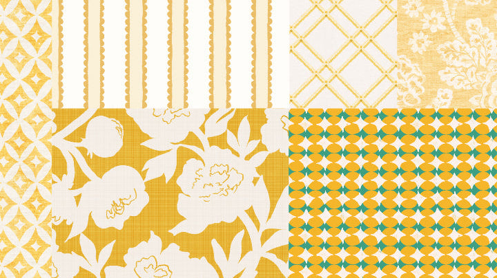

When I think about the colors I want to use in a room, I start with the feeling I want to create. Am I after a restful, calming space? Something energetic and bright? Or perhaps a room that evokes a memory of a time and place? When I develop colorways for a print, I’m often trying to capture different emotions, offering different looks for different moods. And color is only part of the story. The patterns we pair together can shift the feeling, too.
So, let’s take one floral print in three different colors, pull in some coordinating patterns, and see how each combination changes the mood. By the end, we’ll put a name to the feeling each one evokes!
One of the most favorite floral designs I’ve ever created is my ‘preppy peony.’ It’s a two color print, meaning there is a background color and a single color for the vining flowers, so it’s incredibly versatile. It’s feminine without being overly sweet, and the large scale is bold and graphic without taking over. Because the design is tonal, it gives us plenty of room to play with other colors and change its personality. The print stays the same, but the mood can shift quite a bit depending on what we pair it with.
Let’s start with the green colorway and see where we can take it!
When I look at this textile, my mind wanders to a faded garden. The kind of place that feels restful, peaceful, and calm, where the colors have softened with time.
 Rick Rack Stripe Wallpaper in Spearmint
I want to bring in other coordinates that evoke that same feeling, but I don't want everything to match too perfectly. Adding darker greens gives the palette a little depth, while a print with hints of blue introduces just enough contrast to keep things interesting. The result feels collected rather than coordinated, with each pattern contributing something different while still belonging to the same story.
For the next colorway, I’m in the mood for something a little warmer and more playful. The dusty rose peony has a nostalgic feel, but I don’t want to lean too far into the cottage floral look. Pairing it with a ticking stripe brings in a bit of energy, while the geometric adds structure and a more contemporary edge.
 The colors feel harmonious, but the contrast between the large, flowing flowers and the smaller, orderly geometric keeps things from feeling too overly coordinated. This combination feels warm, collected, and just a little bit unexpected.
Our first two colorways took us from a restful, faded garden to something warmer and a little more playful. Now let's take things in a different direction.
Everyone loves blue, myself included! But rather than going with a muted gray blue, I chose a deeper navy teal that has me thinking of coastal homes, heritage prints, and traditional interiors. But I couldn't resist taking it in a preppier direction. The blue gingham brings in that classic, tailored feel, while the green and blue geometric adds energy and contrast. But I didn't want to stop there! By bringing in the minty green dots and the ticking stripe in British racing green, we open up a whole new range of possibilities. These lighter, fresher colors balance the deeper blue and keep the collection from feeling too serious.
The result is classic and preppy, but with a fresh, colorful edge. It feels familiar without being predictable, and gives us plenty of room to mix things up even further.
And there you have it! One peony, three colorways, and three very different moods. It's a good reminder that choosing a print is just the beginning. The colors and patterns you bring alongside it can take the design in all sorts of directions, from restful and understated to warm and playful to classic and preppy. So when you're putting together a room, don't be afraid to experiment a little. You might be surprised where your favorite print takes you!
If there are any of these prints you'd love to see in wallpaper or textiles, please reach out! I'm also happy to create a bespoke colorway just for you.