
Have you ever tried to put two different patterns together in a room and they look like frenemies instead of best mates? Maybe you’ve never tried to mix prints because you don’t even know where to start.
I’m here to give you a few rules of thumb to help you mix prints like a pro. But we all know what they say about rules, right? Once you know ‘em, you can break ’em.
So let’s go easy. Find a print you love. It doesn’t matter the type, style, complexity, or color story. Just pick something you adore and let’s begin!
Color
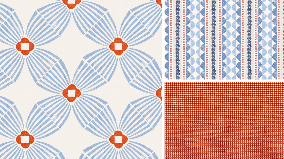
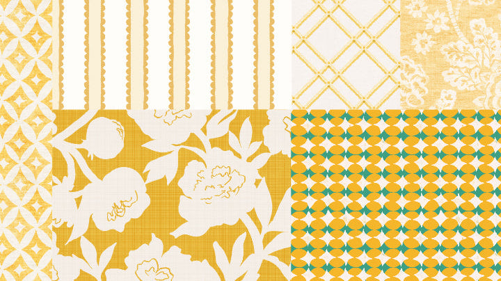
Do you have the print in front of you? Great. Now look at the colors in that print. What’s your favorite color in the pattern? Does it have a cornflower blue you love? Start there! Does it have an olive green you’re drooling over, perfect! It doesn’t matter what color you start with as long as the patterns you're mixing have a hue in common, you’ve already got a place to begin.
 Look for another print that has that same color or a variation of that hue, and slide it up along the first. When you squint your eyes, do the colors look the same or similar? Good job, you’ve found your common thread. Let’s move on to the next “rule!”
Scale + Density
The next thing to consider is scale. The scale of a print is simply how large or small the elements in the design are.
Do you have a flower the size of a dinner plate on your fabric? That’s a large scale print. Are the flowers about the size of your pinkie nail? You probably have what’s known as a ditsy or calico print on your hands.
Mixing patterns is easier when you vary the scale of the prints in relation to each other. A loose, flowy floral can look fantastic with a small scale geometric, and vice versa.
Density is related to scale, but it’s not quite the same thing. You can have a really large geometric print with plenty of negative space, or one that’s just as large but tightly packed together.
 Varying the density along with the scale helps keep your patterns from competing for attention. Think of it as giving each print a little breathing room.
A quick takeaway:
Large + Medium + Small is a great way to think about mixing scales. You don’t have to use exactly three patterns, of course. The idea is simply to avoid having every pattern in the room operating at the same size and volume.
Type of Pattern
This is where things get interesting.
To create the contrast you’re looking for, try adding in a different type of print. There are plenty to choose from:
- Floral
- Geometric
- Stripe
- Plaid
- Dot
- Abstract
- Textured Tonal
- Etc., etc., etc.
If your first pattern is a large, bold floral, try mixing it with a small scale geometric. If the first pattern you love is a stripe, pair it with a textured tonal. Do you love the plaid you found? Grab that ditsy flower pattern that has the same color and squint your eyes.
Looks pretty good, right?
 Adding different types of patterns creates contrast and visual interest without requiring everything to be wildly different.
Overall Feel
This is one of the more difficult things to assess, but with practice you’ll start recognizing which patterns are singing in harmony and which ones are way off key.
If you’re starting with a traditional floral, that contemporary geometric might not suit, even if the color palette is the same. If you want to mix a bold, abstract organic print, a nostalgic flour sack stripe might not be the best choice.
 Consider how your patterns make you feel. Are they cozy and cottage-y? Playful and contemporary? Do they evoke faded nostalgia or a groovy vibe? Ask yourself whether they belong in the same family, even if they skip a generation.
A crisp geometric and a loose floral might have completely different structures, but if both have a fresh, contemporary feel, they can work beautifully together. And conversely, two patterns can share a color palette and scale but feel like they’re from completely different planets.
Put It All Together
Once you’ve had a little practice and understand the basics, go ahead and mix it up. There are no pattern police waiting outside your door, so give it a go!
Start with one pattern you love. Find another that shares something with it, then introduce a little contrast. If everything feels too coordinated, loosen it up. If everything feels chaotic, look for a common thread.
And remember, you don’t have to get it right on the first try. Move things around, squint at them, walk away, come back, and trust your eye.
Now go forth and mix some prints. Your decor will survive.