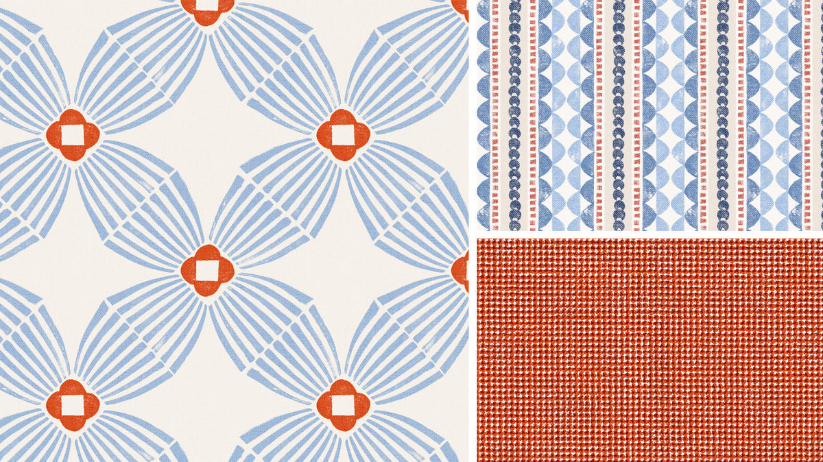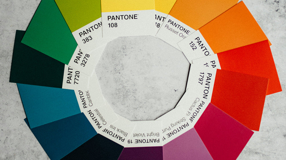

It’s a proven fact: people respond emotionally to color long before they notice all the other details. Have you ever walked through a store and found yourself drawn to something simply because of its color, even when you had no intention of buying it? Most of us have.
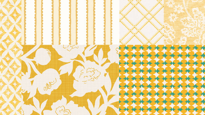
Color has the power to shape how a room feels before we notice the furniture, the artwork, or even the patterns. Add a smattering of yellow and it immediately feels happier. Go dark and moody with black charcoal and it becomes glamorous. Decorate with muted sage and you feel a sense of calm.

"Color Notes" is where I'll share ideas about decorating with color, mixing patterns, choosing wallpaper and textiles, and creating homes that feel layered rather than perfectly matched. You'll find color palette ideas, wallpaper and textile inspiration, pattern pairing for curtains, pillows, and upholstery, behind-the-scenes glimpses of my creative process, and the ideas currently filling my sketchbook.
Rooms don’t have to be neutral to feel timeless. Color doesn’t have to be loud to make an impact. Mixing patterns together gets easier the more you look and learn. So dive in. The color is just fine.